
A category built on claims, rebuilt on what is actually in the bottle.
VREA Cosmetics was founded by an esthetician and makeup artist who had spent years correcting other people’s marketing. Brand identity, editorial storefront, a Claude-powered beauty advisor and an ingredient education hub — designed and built in five weeks, for a customer who has learned to distrust the category.
A beauty brand whose whole proposition is not overstating
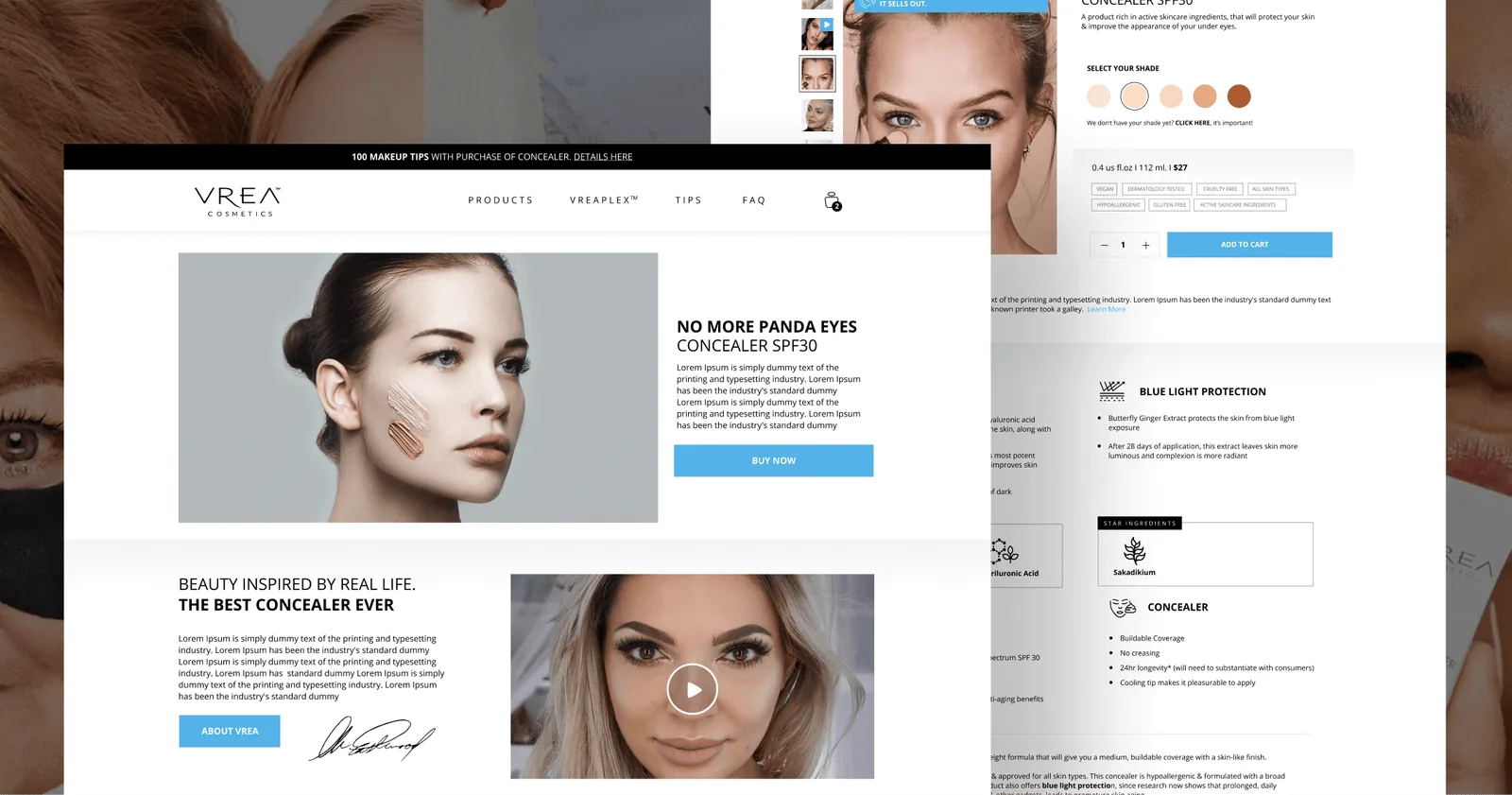
VREA emerged as a beacon of authenticity amidst a sea of misleading information and false claims rampant in the beauty sector. Its founder is an impassioned esthetician and makeup artist, and the brand’s point of difference was never a formulation secret — it was a refusal to overstate. The digital presence had to carry that, which is a harder brief than it sounds: every convention in beauty e-commerce is built to flatter a product.
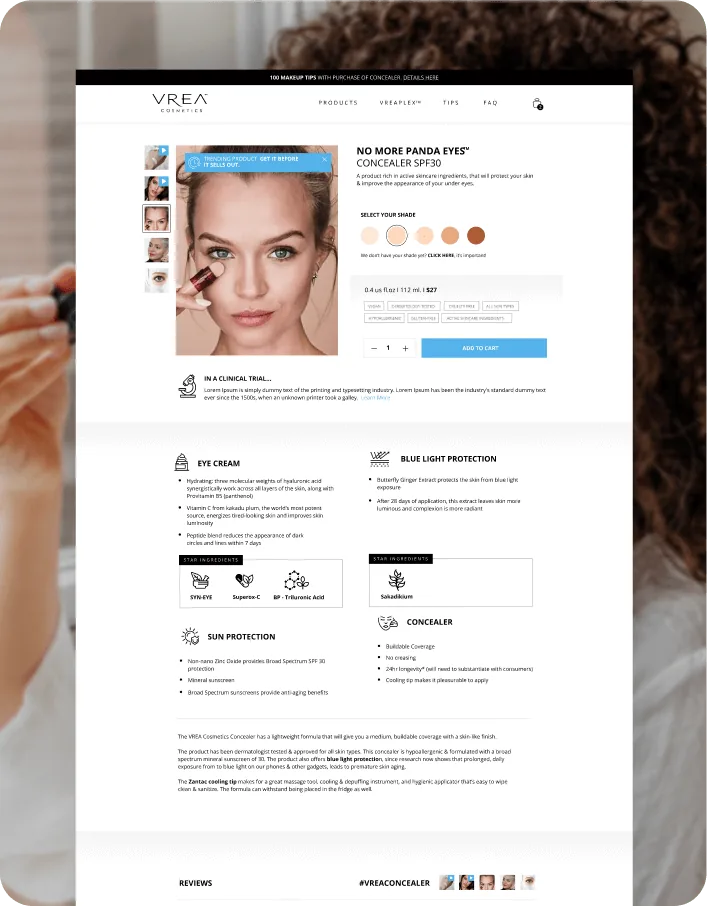
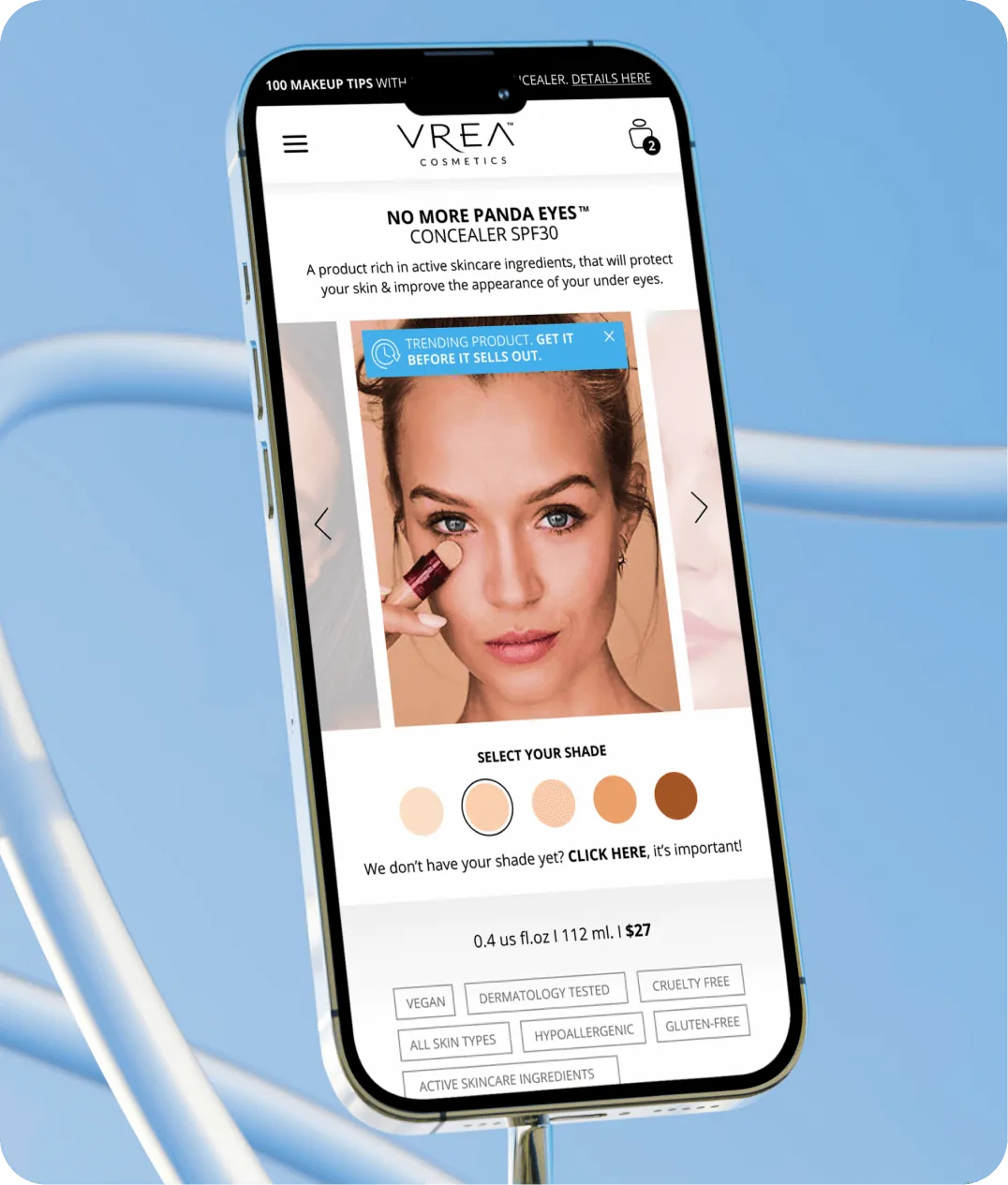
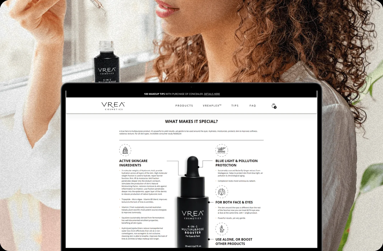
So the platform argues the opposite way. Ingredient transparency sits on the product page, not buried in a tab. The education hub explains mechanisms rather than benefits. And the AI advisor recommends through conversation while showing its reasoning, so a customer who has been burned before can audit the advice instead of trusting it.
The customer arrives already sceptical
The ingredient-conscious beauty buyer has read the label before, found the active at a concentration too low to do anything, and stopped believing the front of the box. That customer does not want a louder claim. They want the mechanism, the concentration and the trade-off — before they are asked to add to basket.
Claims without mechanism
The category default is an adjective — brightening, restorative, clinical. None of it survives contact with a reader who knows what the active actually does.
Discovery by dropdown
Filtering by skin type sorts a catalogue; it does not answer a question. The customer with three overlapping concerns gets no useful help from a select menu.
Silence after purchase
Most of the value in skincare arrives through correct use over weeks. A receipt and a shipping notice do nothing for the customer about to use it wrong.
Recommendation as a conversation, with the reasoning attached
The advisor is Claude, trained on VREA’s product catalogue, ingredient profiles and skin-concern taxonomy. A customer describes the problem in their own words — not in the vocabulary a filter menu expects — and gets back a recommendation carrying the concern it addresses and the active doing the work.
Recommends only from the catalogue
The advisor answers out of VREA’s own products, ingredient profiles and skin-concern taxonomy. It cannot invent a formulation or point at a competitor.
Shows the reasoning, every time
Each recommendation arrives with the concern it addresses and the active doing the work, so a sceptical customer can check the logic rather than take it on faith.
Never makes a clinical claim
Medical language is out of bounds by construction. In a category built on overstatement, what the advisor refuses to say is as load-bearing as what it says.
The constraint list is the product. A fluent recommendation engine is easy; one that will not overstate in a category defined by overstatement is the thing that matches what VREA actually sells.
The education hub, built as the reason to buy
Most beauty sites treat ingredient information as compliance text. Here it is the merchandising. Each active gets its mechanism, its concentration and its honest limits, and the product pages pull from the same source — so the claim on the page and the explanation in the hub cannot drift apart.
What it does, at what concentration, and why VREA uses it where it does — written for a reader who has already been lied to once.
The filter set named outright, with the trade-offs stated plainly rather than hidden behind a marketing adjective.
Molecular weights explained, because “hydrating” on its own stopped meaning anything in this category some years ago.
Six workstreams, delivered as one launch
A brand refresh that lands weeks before the platform it belongs to is two launches, not one. Identity, storefront, advisor and automation were scoped as a single delivery so the brand arrived intact.
Complete Brand Identity
Logo, colour palette, typography, photography direction, packaging guidelines, and a brand style guide covering every touchpoint from digital to physical.
Editorial E-Commerce Platform
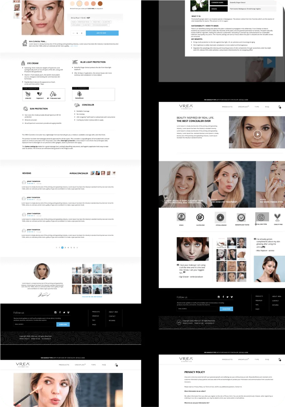
Full e-commerce site with ingredient transparency at the product level, editorial content integration, and a purchase experience designed for the informed beauty consumer.
AI Beauty Advisor
Claude-powered conversational advisor trained on VREA’s product catalogue and skin science — personalised recommendations through a natural, expert-feeling dialogue.
Ingredient Education Hub
Content-driven section covering active ingredients, their mechanisms, and how VREA uses them — turning product discovery into a trust-building educational experience.
Post-Purchase Automation
Intelligent email sequences covering onboarding, usage guidance, routine building, replenishment reminders, and complementary product introductions — triggered by behaviour, not calendars.
Customer Insights Dashboard
Internal analytics giving the VREA team visibility into sales trends, product performance, advisor usage, and customer engagement across the full platform.
Five flows, triggered by behaviour rather than a calendar
Skincare pays off through correct use over weeks, so the sequence follows what the customer actually does — opened, used, ran low — instead of firing on day three because it is day three. Onboarding, usage guidance, routine building, replenishment reminders and complementary product introductions each wait for their trigger.
What the customer sees
Guidance that arrives when it is useful — how to layer the booster in week one, how to read the barrier improving in week three, a replenishment note timed to the size they actually bought.
What the team sees
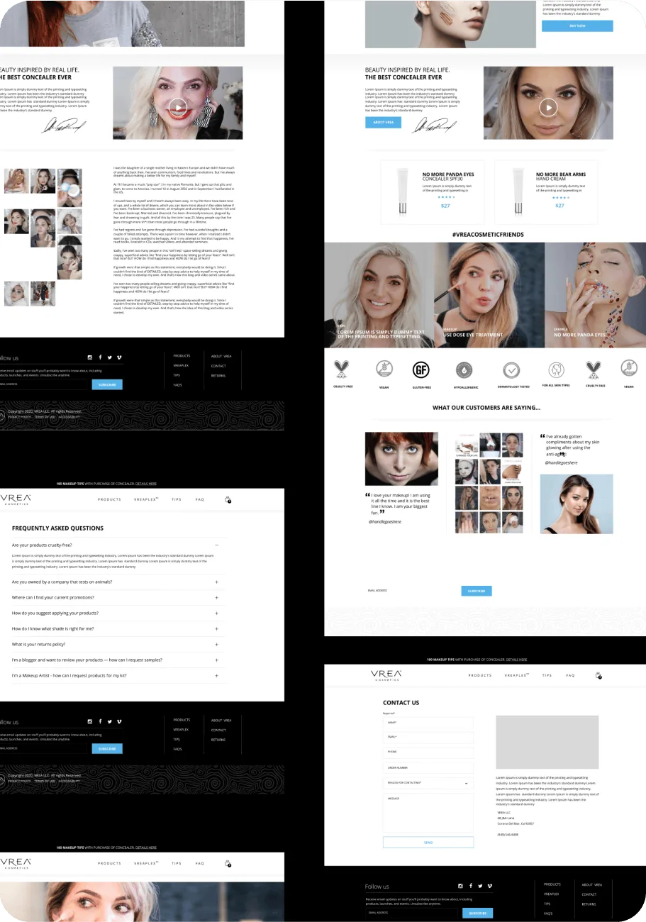
The insights dashboard: sales trends, product performance, advisor usage and engagement across the platform, so merchandising decisions come off data rather than instinct.
Five weeks, brand first
The order mattered more than the pace. Positioning came out of the founder’s own expertise before a single screen was designed, which is why the visual language and the advisor’s voice ended up saying the same thing.
Brand discovery & positioning
Deep sessions with the VREA founder to extract the brand’s authentic point of view — the expertise, the frustrations, the customer relationships, and the formulation philosophy that made VREA genuinely different. Everything else was built on this.
Visual identity
Logo, colour system, typographic scale, photography direction and packaging guidelines. The visual language had to feel premium and clean without tipping into the cold minimalism that makes beauty brands feel unapproachable.
Platform UX & build
Homepage, product pages with ingredient transparency sections, the advisor interface and the education hub. Every layout decision was made with the sceptical, ingredient-conscious consumer in mind rather than the impulse buyer.
Advisor & automation
The Claude-powered advisor trained on the catalogue, ingredient profiles and skin-concern taxonomy, then the behaviour-triggered post-purchase flows behind it. Recommendation through conversation, not dropdowns.
A brand that reads as honest, and sells better for it
VREA launched its new digital presence to strong early response. The identity refresh drew organic engagement on social — customers began sharing the visual identity unprompted — and the returning-customer rate improved once the post-purchase flows were live, particularly in replenishment-driven categories.
Customers who engaged with the beauty advisor spent more per order than those who browsed unaided — the conversation did work a category dropdown never has.
The education hub became one of the highest-engagement surfaces on the site, which validated the founder’s thesis that transparency sells better than claims do.
Post-purchase flows covering usage and routine building cut the volume of “how do I actually use this” enquiries reaching the team.
What we took from it
Positioning before pixels. The founder’s own vocabulary — what she had spent years correcting — became the brand voice, the hub’s explaining register and the advisor’s constraints. Designing first would have produced three different voices.
Scope the AI to one honest job. The advisor recommends from the catalogue and shows its reasoning. It does not diagnose and it does not chat. That narrowness is what let it ship inside a five-week window, and what makes it safe to point a sceptical customer at.
Transparency is merchandising. Treating ingredient detail as the reason to buy rather than as compliance text put the most-read content and the buying decision on the same page.


Idea in your head? Let’s
bring it to life.
Got a project? A wild idea? Or just want to say hey?
We're here for all of it — reach out anytime.