
A directory people gave up on, rebuilt into somewhere worth browsing.
GreenHub is an Australian platform helping people discover and support local businesses that matter. In five weeks we rebuilt the experience — new UX architecture, a warm visual design system, smart search and mobile-first listings — and browsing came out three times faster.
A good mission, behind an experience nobody finished
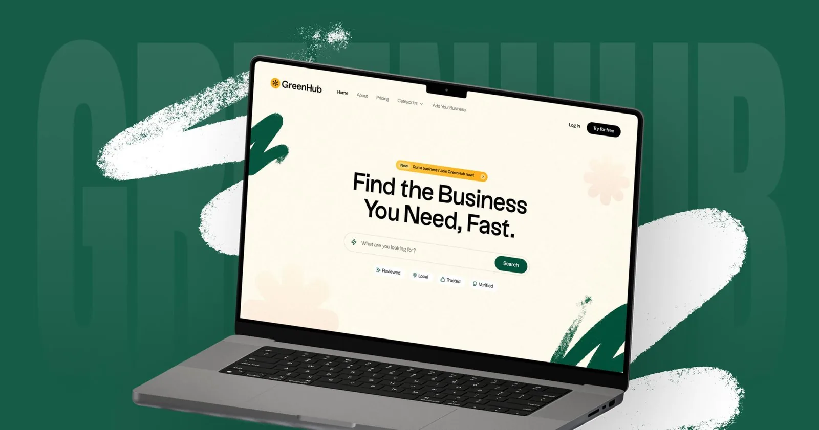
GreenHub is an Australian-born platform with a mission to help people discover and support local businesses that matter. The mission was never the problem. The experience was: discovery took too long, the structure did not match how people actually look for a business, and the whole thing had been designed for a desktop that most of its users were not sitting at.
We stepped in to redesign it — making discovery simple, visually engaging and mobile-friendly. The result is a clean, intuitive platform where users explore curated listings, and where the information architecture was rebuilt from scratch rather than restyled in place.
Where people were dropping off
The audit interviews and journey mapping kept landing in the same three places. None of them were visual problems, which is why a restyle would not have fixed any of them.
Structure that fought the search
Category taxonomies that made sense to the platform and not to the person looking. Finding a business meant learning how the directory was organised first.
Desktop-shaped on a phone
Most discovery happens on mobile, one-handed, somewhere. Layouts adapted down from a desktop grid rather than being designed for the screen they were used on.
A directory, not a destination
Rows of listings with nothing to pull a visitor deeper. Nothing surfaced the impact stories or neighbourhood context that made these businesses worth choosing.
Warmth and trust, defined once and reused everywhere
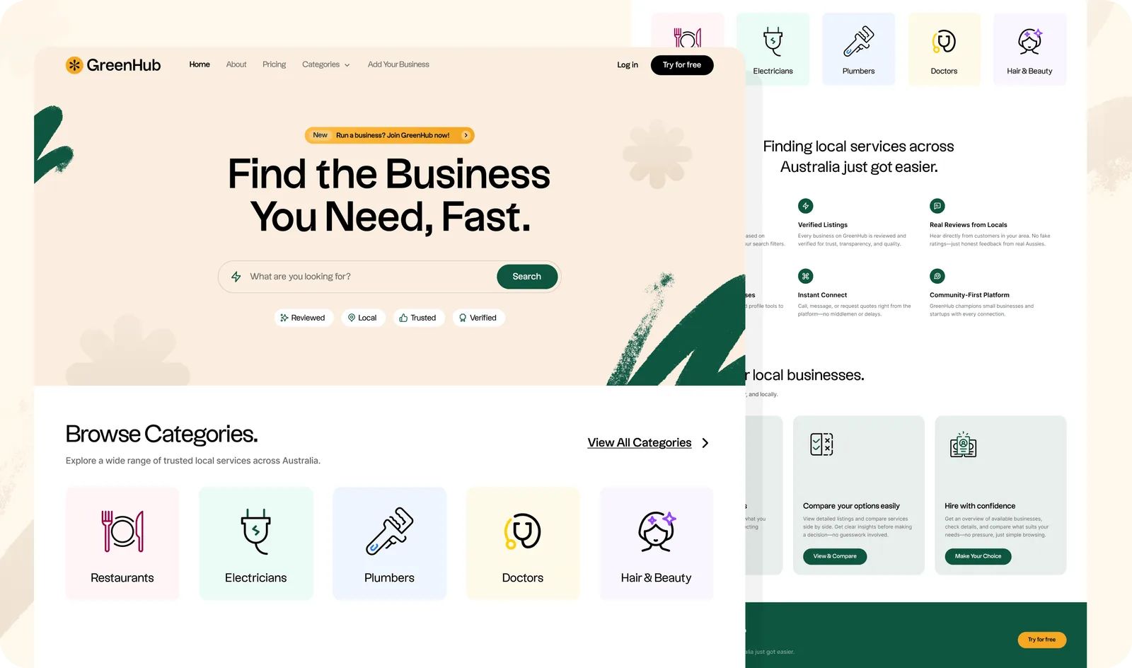
The brief was a language that felt eco-conscious and credible at the same time. That resolved into a forest-green base with an amber highlight, a type hierarchy that stays readable at listing density, and a component library rather than a set of screens — which is what let the platform grow categories without a redesign.
Warm, not corporate
An eco-conscious directory that looked like enterprise software would have undercut the whole proposition. The palette and type carry warmth without losing the credibility a business listing needs.
Components, not screens
A listing card, a category tile, a contact flow — defined once and reused everywhere, so the platform could add categories and cities without redesigning anything.
Mobile is the default view
Most discovery happens on a phone, standing somewhere. Layouts were designed at the small size first and tested across 12+ device sizes before launch.
The system is the reason five weeks was enough. Once the card, the tile and the filter existed, most of the platform was assembly rather than design.
From a list you scroll to a place you explore
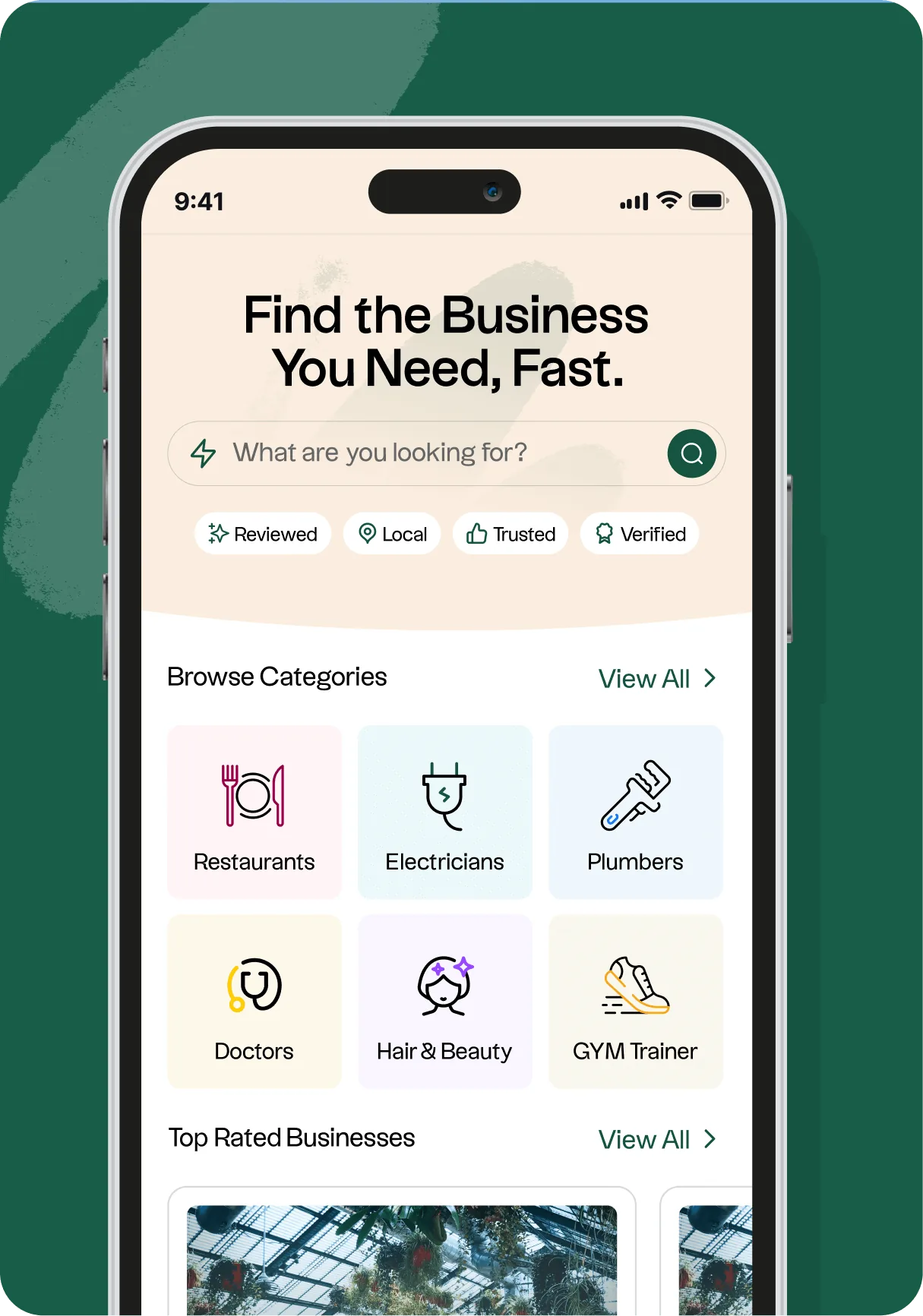
Search, filtering and location sorting handle the visitor who knows what they want. The curated modules handle the larger group who do not — featured listings, impact stories and neighbourhood highlights, which is what turns a directory into somewhere you keep looking.
Search that matches intent
Keyword search over a taxonomy rebuilt around how people ask, so the query does not have to match the platform’s own vocabulary.
Location-aware sorting
Local is the whole proposition, so proximity is a first-class sort rather than a filter buried behind an advanced-search link.
Curated modules
Featured listings, impact stories and neighbourhood highlights give the undecided visitor somewhere to go next.
Six workstreams, one five-week launch
Architecture first, then the system, then the build. Design and development ran as one in-house team, which is what removed the handoff week a redesign this size usually spends re-explaining itself.
Responsive Web Design
Pixel-perfect layouts designed for desktop, tablet, and mobile — tested across 12+ device sizes before launch.
Smart Search & Filtering
Category-based filtering, keyword search, and location-aware sorting that lets users find exactly what they’re looking for in seconds.
Business Listing System
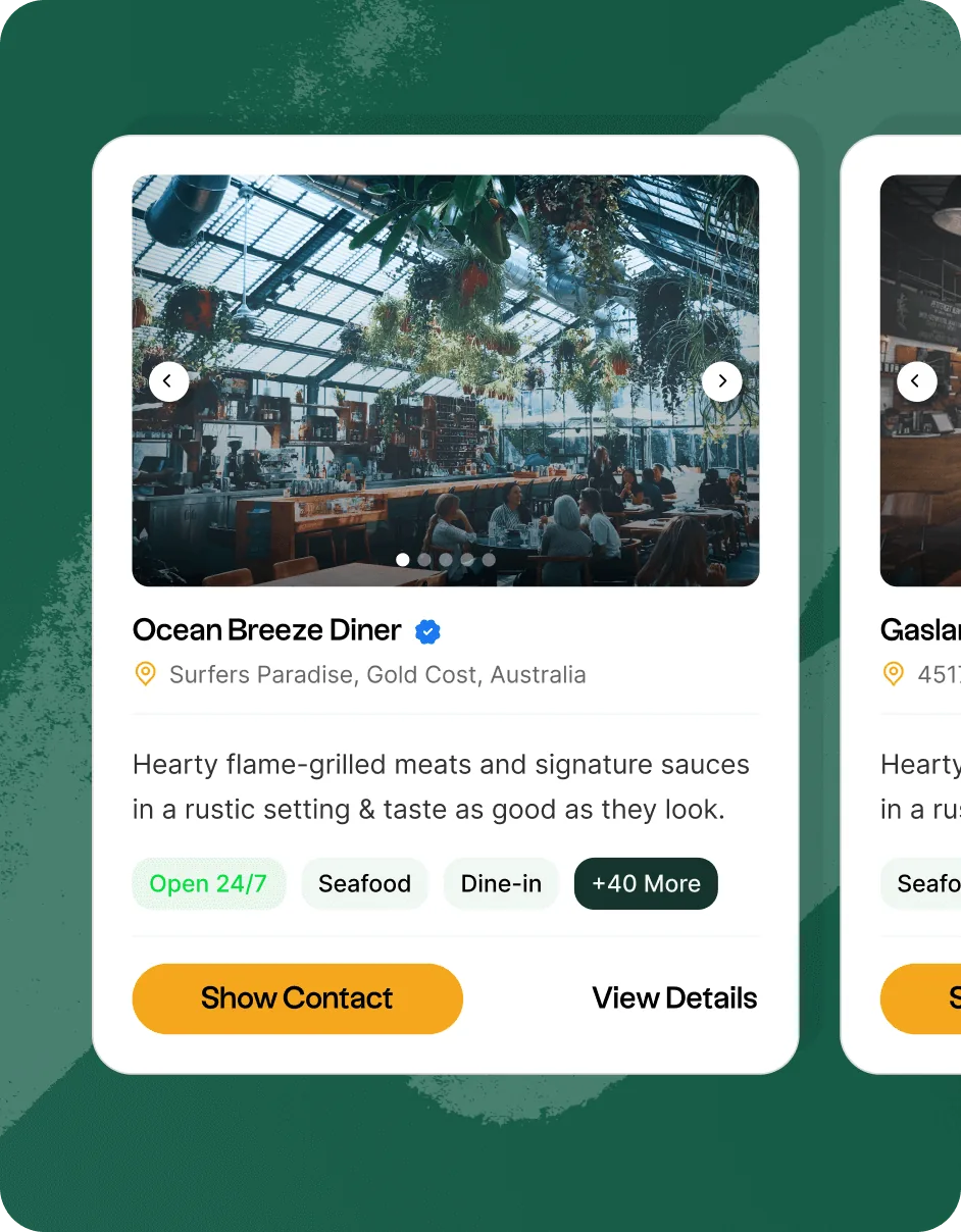
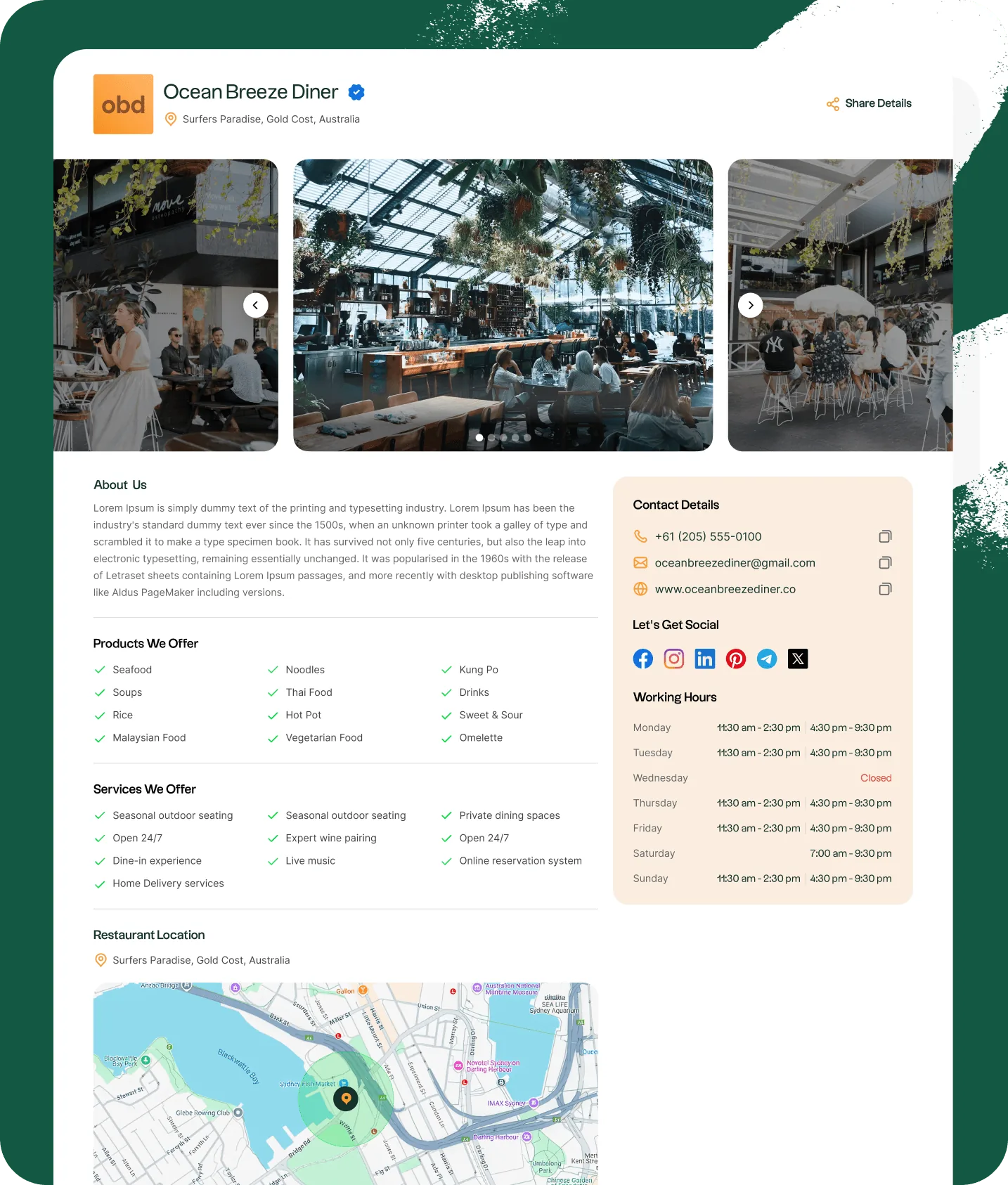
Structured listing pages with social proof elements, category tags, contact flows, and an easy onboarding path for new businesses.
Brand & Visual Identity
Refined GreenHub’s visual language — logo refinements, colour system, typography, and tone-of-voice guidelines for the platform.
Curated Discovery Experience
Homepage modules for featured listings, impact stories, and neighbourhood highlights — turning a directory into a discovery destination.
Frontend Development
Clean, performant frontend code built for speed and maintainability — optimised for Core Web Vitals from day one.
Two audiences, one component library
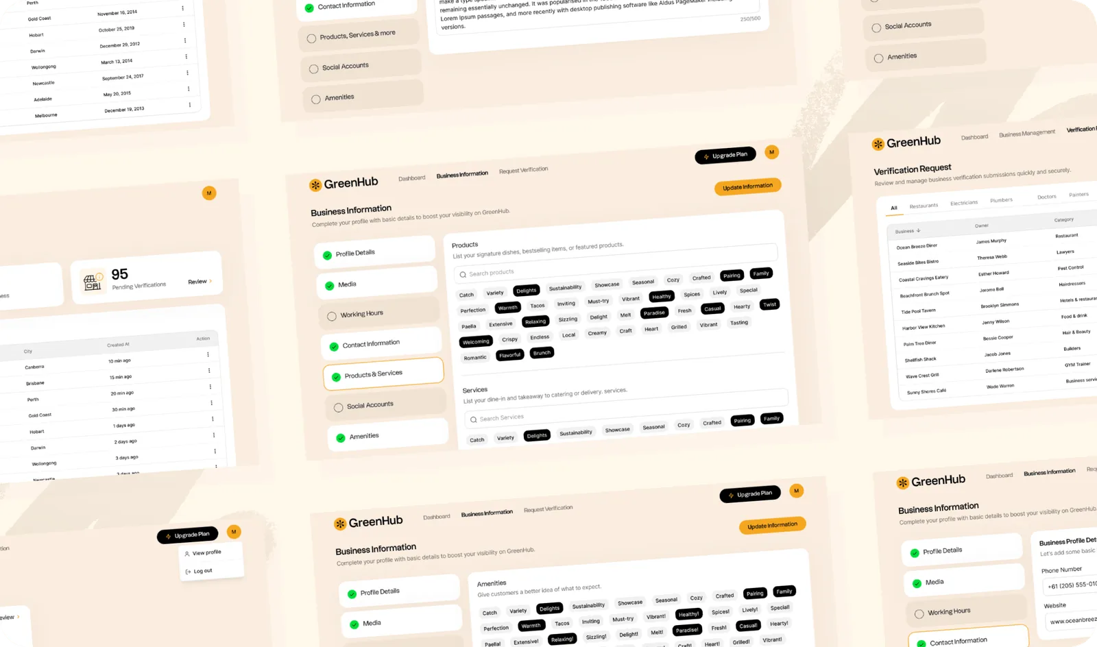
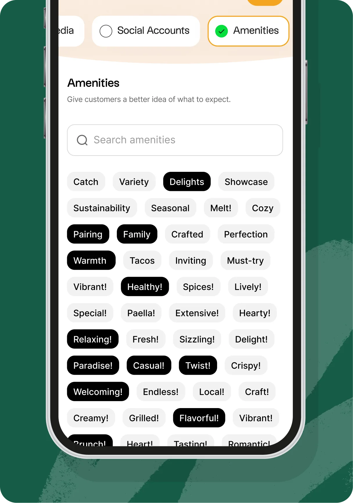
A directory has to serve the person looking and the business being found, and those are different products sharing a database. Both were built from the same components, so a change to a listing card lands on the visitor’s view and the owner’s preview at the same time.
What someone looking sees
Structured listing pages with social proof, category tags and a contact flow that works in one step — because the visit usually ends in a phone call, not a form.
What the owner gets
An easy onboarding path onto the platform and a dashboard to manage the listing, on the same design language the public side uses.
Five weeks, architecture first
The order is the reason the date held. Rebuilding the information architecture before touching the visual language meant the design system was solving the right problem when it arrived.
Discovery & audit
We reviewed existing designs, interviewed GreenHub’s team, and mapped user journeys to understand where drop-off was happening and why. Competitive benchmarking helped set a clear quality bar.
UX architecture
Rebuilt the information architecture from scratch — defining page structures, navigation flows, listing formats, and category taxonomies that would scale alongside the platform’s growth.
Visual design system
Created a cohesive design language grounded in warmth and trust — colour palette, type hierarchy, component library, and iconography all aligned to GreenHub’s eco-conscious brand identity.
Development & launch
Built the frontend with performance and accessibility in mind. Implemented smart search, category filtering, and mobile-first layouts across the entire platform before shipping to production.
Faster to browse, and ready for the next city
GreenHub launched with the new architecture, the design system and the frontend all in place. The team’s own feedback was strongest on brand alignment — the platform finally looked like the thing it had always claimed to be — and the taxonomy was built to extend into additional Australian cities without another rebuild.
New information architecture and a performance-minded frontend turned a directory people gave up on into one they could actually move through.
Mobile traffic converted at a materially higher rate after launch — the payoff for designing at the small size first rather than adapting down to it.
The guided signup flow lifted onboarding completion, and session duration rose after the discovery redesign gave people a reason to keep looking.
What we took from it
Architecture before aesthetics. The drop-off was structural. Restyling the same taxonomy would have produced a prettier directory that was no faster to use, which is the most common way a redesign quietly fails.
A component library is a schedule decision. Defining the card, the tile and the filter once turned most of the remaining build into assembly. That is where the five weeks came from.
Design the small screen first. Mobile was where the traffic already was and where the conversion gain landed. Adapting a desktop grid downward would have inherited every compromise.
Idea in your head? Let’s
bring it to life.
Got a project? A wild idea? Or just want to say hey?
We're here for all of it — reach out anytime.